
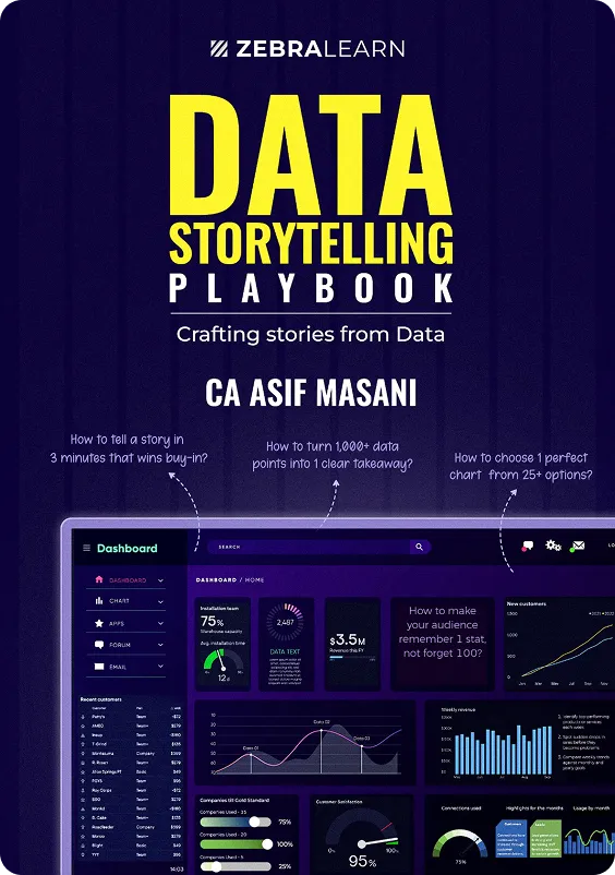
Data Storytelling Playbook: Turn Complex Numbers into Stories
.svg)
Why Most Marketers Struggle To Bring Results?

.svg)
Here’s Why Most Marketing Fails
.svg)
.svg)
.svg)

The Only Book That Turns Marketing Into a System
Is This The Right Book For You?

.svg)
Real-World Outcomes You’ll Achieve

Real-World Skills You’ll Master
.svg)
.svg)
Curriculum
Introduction
What is Data Storytelling?
Why is Data Storytelling Important?
Why Present Data Stories Instead of Numbers and Data Tables
Framework for Data Storytelling
Action Steps
IntroductionWhat is Data?
Ten Different Ways to Analyse Data
How to Get from Data to Insights: The 5 Why Technique
Using the 5 Whys: A Walkthrough
Difference Between Data, Insight, and Action
The Analytics Value ChainWhat is Data Analysis?
Speaking the Language of Data
What is Data Cleaning?
Steps for Cleaning Data Effectively
How to Manage Various Data Sources
Introduction
What is Narrative?
How to Identify Your Audience
Applying Demographic Insights
What is Audience Psychographics?
How to Create Your Audience Avatar
How to Tailor Your Message According to the Audience
Understanding and Uncovering the Context
Type of Audience
1 Type of Audience
2 Type of Audience
3 Audience × Presentation Cases
Action Steps
Conclusion
Introduction
What is Data Visualisation
What is a Report
What is a Dashboard?
What is an Infographic?
What is a Presentation?
Line ChartsBar Charts
Pie Charts
Maps in Data Visualization
Gantt Charts
Bubble Charts
Scatter PlotHistogram
Bullet Charts
Highlight Tables
Mastering Tree MapsBox-and-Whisker Plots
Waterfall Charts
Action Steps
Recap and Conclusion
Introduction
Step-by-Step Creating a Chart in Excel
Customise Chart Elements
Understanding the Chart Elements
Action Steps
Recap and Conclusion
Introduction
Five Key Design Principles
Seven Common Design Mistakes and How to Avoid Them
The Impact of Misleading Graphs on Decision-Making and Perception
Recap and Conclusion
Tip #1: Data Visualisations should have a clear purpose and audience
Tip #2: Choose the Right Type of Chart for your DataTip
#3: Use Colour to Highlight Important Information or to Differentiate or CompareTip
#4: Avoid Misleading VisualisationsTip
#5: Keep your Visualisation Simple. Less is More
Action StepsRecap and Conclusion
Introduction
What is a Dashboard? Why is it Important?
Design Principles for Effective Dashboard Design
How to Create a Dashboard in Excel
Example 1: Sales Dashboard
Example 2: Marketing Dashboard
Example 3: HR DashboardExamples of Bad vs. Good Visualisations (Before/After)Action StepsRecap and Conclusion
Introduction
Why Stories Work
Fundamentals of Storytelling
The Storytelling Arc
Example of the Story
telling Arc
What, So What, and Now What Framework
2X2 Framework
Action Steps
Recap and Conclusion
Case Study 1: Converting a Raw Data Dump Into a Story
Case Study 2: 2×2 Matrix
Case Study 3: Budget vs Actuals Using Waterfall Chart
Case Study 5: Using Heat Maps to Show Website Engagement
Case Study 6: Using Maps to Show Election Poll ResultsAction Steps

What You’ll Learn From This Book

.svg)

.svg)
.svg)
.svg)
.svg)
.svg)
The Book Includes
The Way We Present Data Has Changed. Have You?
Today, decision-makers expect you to be:

.svg)


The Book Includes
When you tell a story, you create empathy, understanding, and memory.
Data without a story is like a map without a compass. It shows direction but doesn’t inspire movement.
In boardrooms, clients’ offices, and investor meetings, the person who tells the better story backed with the right data always wins.
This book shows you how to make your data unforgettable.
Transform the Way You Communicate
with Data Completely


What You’ll Learn From This Book
How We Compare
Success Stories From Leaders Like You


Seize Your CFO Advantage Today


Frequently Asked Questions
Not at all. The book is designed for anyone who works with information from analysts to entrepreneurs.
Both. It teaches how to combine logic, emotion, and visuals to influence decisions.
It includes practical templates, examples, and step-by-step guides you can apply immediately.
You’ll see a difference from your next prYou’ll see a difference from your next presentation if you apply even one framework.esentation if you apply even one framework.
Yes, it’s perfect for analytics, marketing, consulting, or product teams aiming to improve data communication.